

A few months ago my Substack looked like it had an identity crisis. Scroll back to my early Substack posts and you’ll see exactly what I mean. The images weren't bad. Some of them were pretty damn good.
One week, everything was weird. The next, dark and moody. Then something completely different because I’d stumbled across another aesthetic on Pinterest and couldn’t help myself.
I love experimenting. Give me a new visual style, a weird concept, or an excuse to play with AI, and I’m gone for hours, which is great when you’re experimenting. Not so great when you’re trying to build a recognizable brand. Just me having a little too much fun with the generate button.
And eventually, I had to ask myself a question I’d normally ask other founders.
What the hell am I building here?
I didn’t want another collection of pretty pictures. I wanted my Substack to feel like an actual place.
A world you could step into.
A place with its own vibe, mood, strange little details, and personality. Somewhere you’d recognize before you even saw my name attached to it.
So I started over, this time with rules. I stopped collecting styles and started making some decisions. It took me a long time to decide, and I hesitated. But once I did, everything got easier.
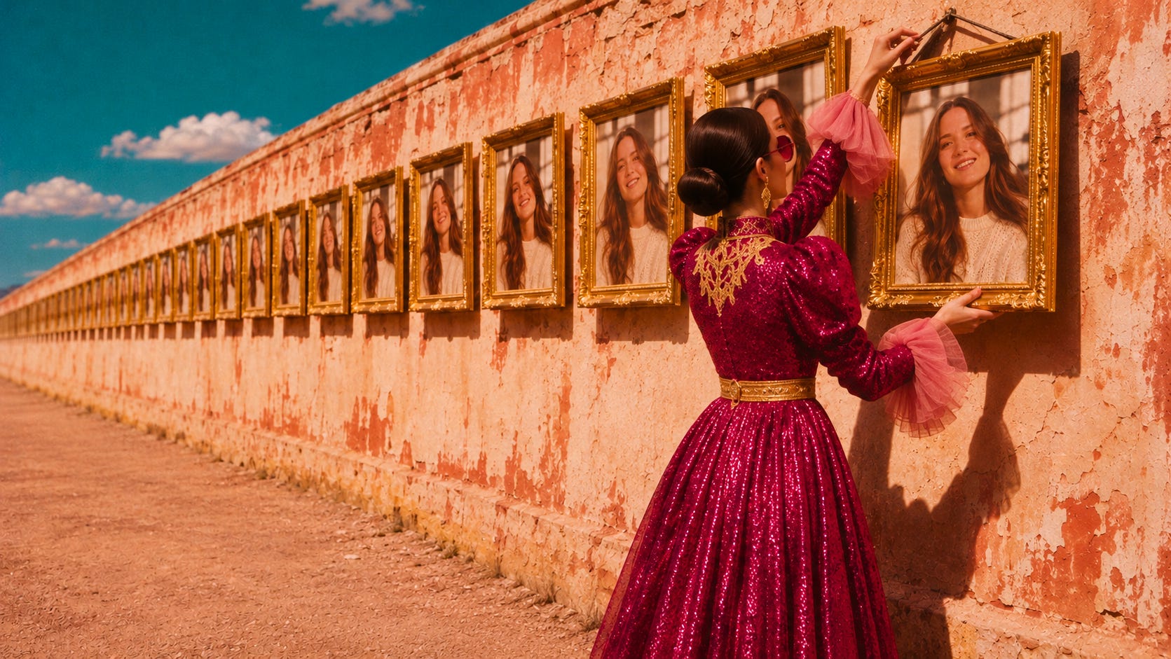
My visual world is a sunbaked daydream with a straight face. A little nostalgic. A little surreal. Dressed for a party, but not particularly interested in entertaining anyone. Think giant daisies, burgundy velvet, impossible landscapes, deadpan faces, and the kind of cinematic grain that makes everything feel like a forgotten film still.
And yes, I make it with AI.
Figuring out what belonged in my world, and more importantly, what didn’t, took far longer.
Which brings me to the whole AI slop conversation. You can't open a Substack Live or scroll through a comment section without someone bringing it up.
“AI is making everything look the same.”
“AI is killing creativity.”
“AI has made it too easy to build a brand.”
Well, I agree with that last one. It has made things ridiculously easy.
You can create a gorgeous image in seconds. Build an entire visual campaign over the weekend and make something that would have required a production team and a pretty generous budget a few years ago.
Except now everyone has access to the same tools, and the same pretty results. And when everyone takes the easy route, we end up in the same place. AI didn’t invent that sameness. It just made it faster to produce.
I think most of that sameness comes from skipping the decision I just described. When you don’t make it, the tool makes it for you, and it makes the same one for everybody.
What slop actually is
Here’s the thing about AI slop.
It doesn’t have to look bad. You look at it and think, Wow, that's pretty. Slop can be technically gorgeous. What makes it slop is that nobody made a single decision about it.
The lighting is nice because nice lighting is the obvious choice. A woman looks like every other AI-generated woman because nobody bothered to give her a personality. The setting is another tastefully decorated studio with the obligatory arched doorway, neutral furniture, and suspiciously perfect sunlight. The tool picked all of it, and you only pressed generate.
That makes sense once you know how these tools work. A model learns from millions of images, so its taste sits somewhere in the middle of all of them. If you leave the choices to it, your brand lands in that middle too, right next to everyone else who did the same.
Think back to 2023, when everyone was turning their hometown, dog, and morning coffee into a Wes Anderson film. For a few weeks, feeds were full of pastel symmetry. It was fun; I played with it, too. And it’s still a popular style on Pinterest.
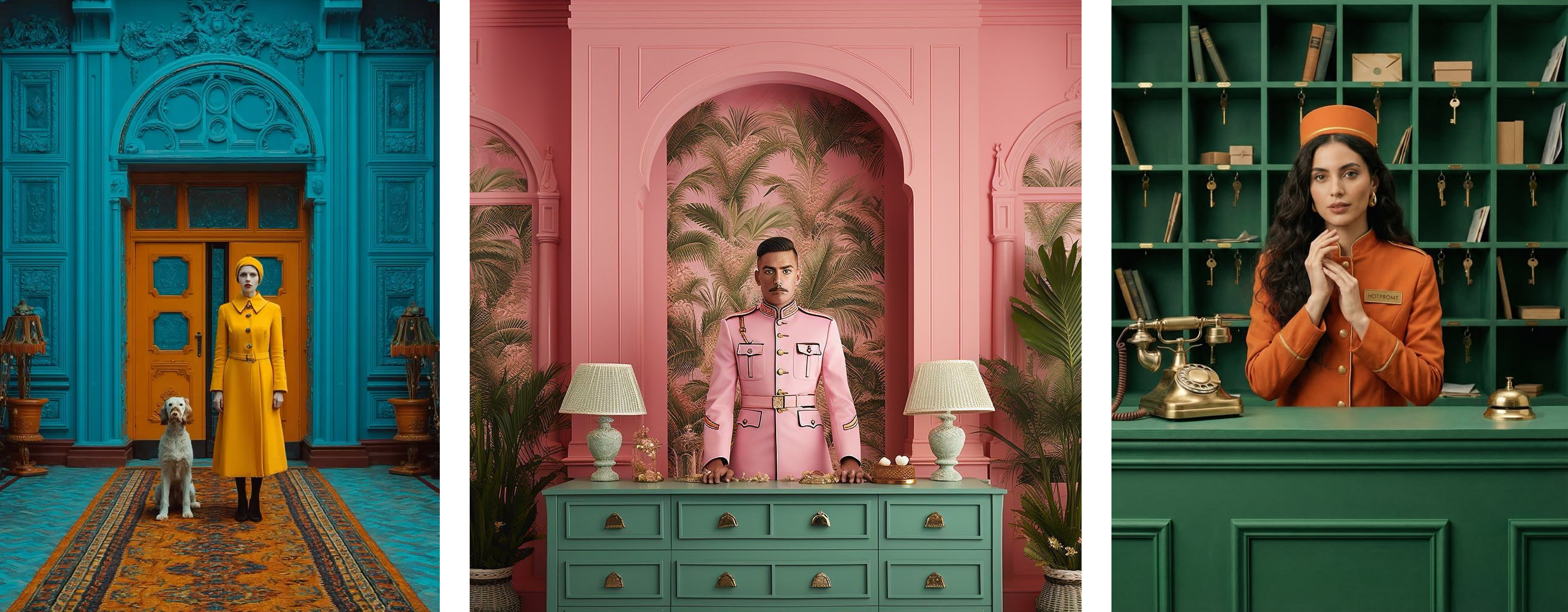
After seeing the same treatment fifty times, could you tell who made what? Nobody came out of that trend with a brand people could recognize. They came out with someone else’s recognizable style without developing one of their own.
And that’s the trap. You can borrow an aesthetic in one prompt but that doesn’t mean you’ve built a brand.
You can have great taste and still build a forgettable brand.
There are two ways I see this going wrong.
The first is what I call the pretty-picture problem. You have an incredible eye. You know how to prompt. Your images could sit comfortably inside a glossy editorial magazine. But there’s no clear connection between any of them and what your brand actually stands for.
Because looking impressive and being recognizable are two very different things.
Then there’s the other side.
You have a solid brand strategy. You know your audience, your positioning, what you believe, and what you’re here to challenge. And then you open an AI image generator and type: “Professional woman working in a modern office, warm tones, realistic photography.”
And out comes another woman smiling at a laptop in a suspiciously spotless office. Your rebellious brand now looks like a corporate wellness brochure.
All that strategic thinking, only to let the tool dress your brand in the same outfit as everyone else.
You need the thinking AND the taste.
One decides what your brand should communicate. The other gives it a face people can recognize. And if you’re using AI to build that face, you need to start treating the creative choices as something more than prompt ingredients.
Your brand is hiding in the details you’re not deciding.
When people ask me about AI image prompting, they usually want to know which model to use, which words create better results, or how to get that cinematic look. Almost nobody asks what they want the image to feel like.
Let’s start with the light.
Lighting changes how an image feels before you’ve even had time to think about it. A harsh camera flash gives you that slightly uncomfortable, caught-in-the-moment feeling. Like someone took a photograph at a party you weren’t supposed to be at.
Golden hour sunlight makes almost everything look romantic, which is lovely until every brand starts looking like a summer holiday campaign.
Now compare these two prompts.
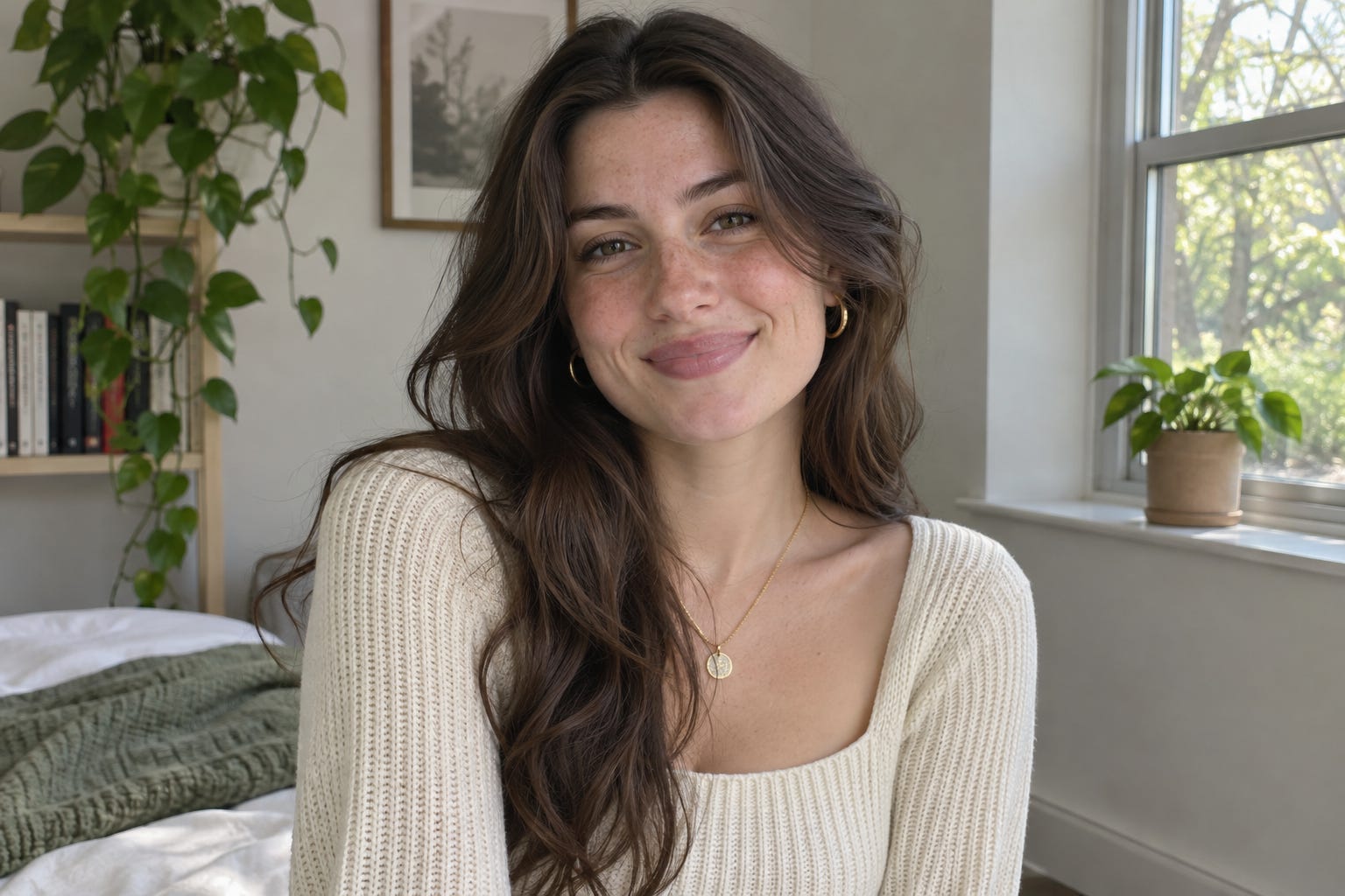
“A woman in a room with natural lighting.”
And:
“A woman standing in a dark room, illuminated by a single harsh camera flash from the left. Deep shadows across the wall, visible skin texture, unretouched editorial photography.”
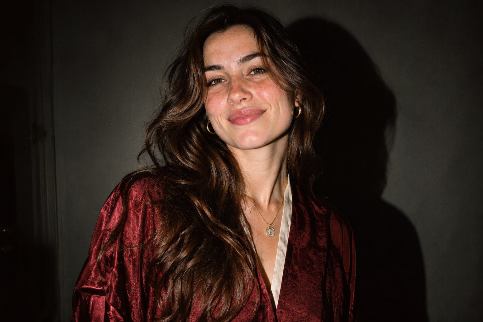
Same woman and same room but completely different feeling. And the difference isn’t some magical prompting trick. It’s that someone actually made a decision.
Look at her face, though. Two different prompts, and I got the same pretty, smiling woman both times, because I never decided who she was. Try the prompt yourself in ChatGPT and you’ll probably meet her too, in some version.
Then there’s the mood.
I love deadpan expressions. Give me someone staring blankly into the camera while something completely ridiculous happens around them, and I’m happy.
A woman standing beside a giant velvet curtain in the middle of nowhere?
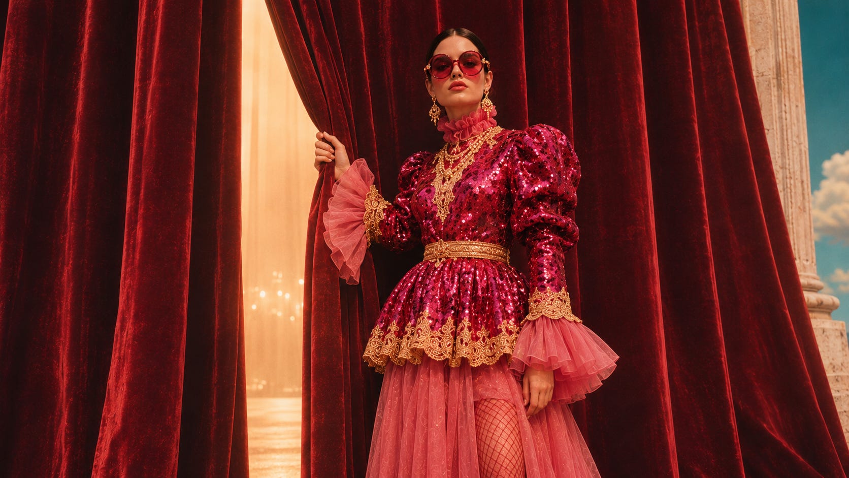
Love that.
Me sitting in a velvet red chair looking unbothered and overdressed in a field of giant daisies?
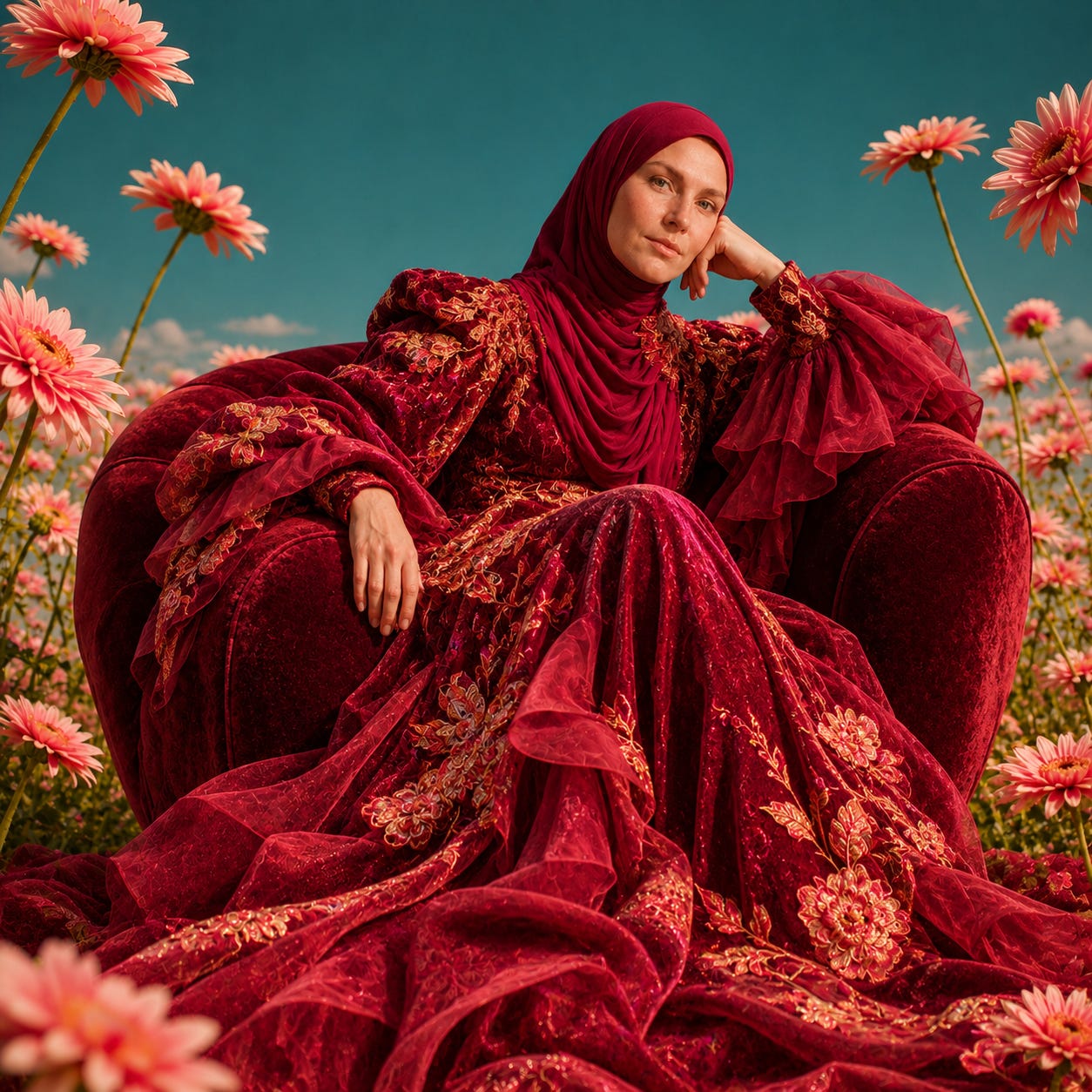
Even better.
That slightly absurd, straight-faced feeling is something I want people to associate with my visual world. It makes me curious and it makes me look twice.
That’s what mood does. It tells people how they’re supposed to feel in your world. Maybe yours is playful. Mysterious. Uncomfortable. Intimate. Chaotic.
But please, for the love of good design, don’t tell me your brand mood is “aesthetic.” Everything has an aesthetic.
What does yours actually feel like, and who’s living in this world?
This is where you can have a lot of fun.
Your brand doesn’t need another perfectly styled founder smiling into a camera. Unless that’s genuinely what you want to communicate.
You can have recurring characters. Strange personalities. People who look like they have actual lives instead of existing solely to advertise your latest offer.
Or maybe you don’t need people at all.
An empty velvet chair in the middle of a field can tell a story. So can a half-finished chess game. A suitcase left in an impossible landscape. A single hand reaching through a curtain.
You don’t always need a face to give an image personality. You need something worth looking at. And no, not everyone has to relate to it.
In fact, I’d argue that’s kinda the point.
A brand that tries to make absolutely everyone feel at home usually ends up looking like a hotel lobby.
Finally, build the world around it.
This is my favorite part. And the part I used to skip entirely.
Imagine your brand was a movie.
Where would it take place? What would the weather be like? What kind of furniture would you find in the rooms? Would it always feel like late afternoon? Or maybe midnight? Would the people wear beautifully tailored clothes while standing in completely absurd situations? Would everything feel polished and perfect, or slightly worn around the edges?
When I started asking myself these questions, my brand visuals became much more interesting to create. I wasn’t starting every image with a blank canvas anymore. I had a world to work with.
A palette. A mood. A photographic treatment. A sense of humor. Recurring details. And a growing list of things that simply didn’t belong there. That’s the difference between generating random images and building a visual identity.
One gives you something pretty to post today and the other gives you something you can keep building on.
Think like a film director, not a prompt collector.
One of my favorite examples of recognizable visual storytelling is Wong Kar-wai.
Watch In the Mood for Love or Chungking Express.
The saturated colors, green fluorescent lighting, cramped interiors, the rain, and the way characters seem to exist in their own lonely little worlds. You could pause certain scenes, remove the title, and still get a pretty strong sense of whose film you’re watching.
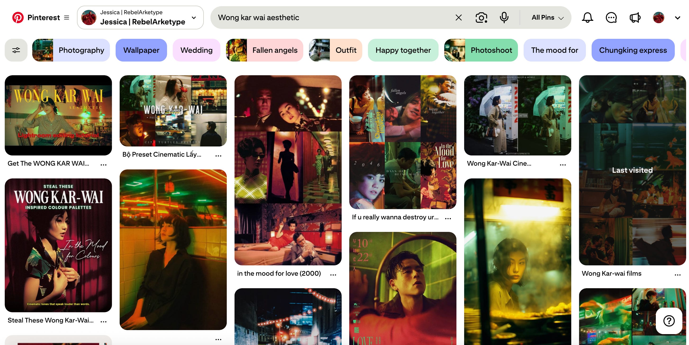
That’s not because every scene looks identical. It’s because there’s a recognizable way of seeing the world behind the camera. The choices repeat but the feeling stays familiar.
And that’s what I’m trying to build with my own visual world. Not the same burgundy curtain in every image. Not the same giant daisies until everyone gets sick of them.
But a recognizable visual language.
Something that gives me room to experiment without losing the plot every time I discover another pretty aesthetic on Pinterest. Because I still love experimenting, I’m not giving that up.
But now there’s a difference between playing around and creating something that actually belongs to my brand. And AI makes that process incredibly fun when you’re the one calling the shots.

Time for a little brand reality check.
Here’s something I want you to try. Take the last six images you’ve published. Put them next to six images from other brands in your space and cover the names and logos.
Would someone who doesn’t know you be able to pick yours out? If the answer is no, you’ve got some decisions to make. And before you blame the AI generator, go through those six images again.
Ask yourself this:
Did I choose the lighting, or did I just accept what came out?
Is there a consistent feeling across these images?
Do the characters and settings belong to the same world?
Would I recognize these images without my name attached?
What makes them mine?
You might discover that you’ve been making fewer creative decisions than you thought. I certainly did. And I say that as someone who spends an embarrassing amount of time experimenting with AI visuals.
The tool isn’t the problem. We just kept giving it the keys and letting it drive wherever it wanted. But not anymore.
Next week, I’m going to show you how I started putting rules around my own visual world.
The choices I made, the things I banned and how I keep my visuals recognizable without creating the same image over and over again.
I’ll show you how you can start building your own, even if you’re currently sitting on a Pinterest board full of seventeen completely unrelated aesthetics.
Believe me, I know that particular struggle. Make your decisions first, then let AI do the heavy lifting.
What’s one thing that would never show up in your brand’s images? Drop it in the comments. I’m collecting them for next week.
Gotta go, something’s burning. Probably my image credits.🔥

Part two lands next week. Subscribe so you don’t miss it.