
Pretty Doesn’t Stop the Scroll
#07 NERVE 👁 Your visuals need more nerve than polish
You’re reading The SIGNAL™️ series — a series for founders who refuse to perform their way to visibility.
Each week breaks down one part of the S.I.G.N.A.L™️ system — the method behind sharper positioning, stronger pull, voice with bite, visuals with nerve, and a brand that works harder than your posting schedule.
You are here in the SIGNAL™️ series : “Nerve”
The goal is not to make you louder.
It’s to make your brand sharper, more magnetic, and harder to ignore — without turning your whole damn life into content.
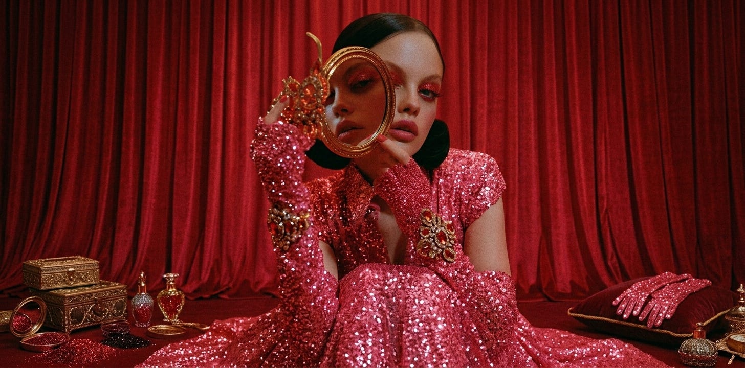
A lot of brands look good.
That’s exactly the problem.
They look clean, tasteful, professional, softly premium, and perfectly acceptable.
And then they disappear.
Because they get scrolled past with all the other clean, tasteful, professional, softly premium brands sitting in the same little aesthetic waiting room.
The feed is not an art gallery.
People are not strolling through with their hands behind their backs, gently admiring your layout choices.
They are moving fast. Thumb first. Attention half-open. Brain already trained to skip anything that feels familiar.
That means pretty is not enough.
Pretty can help. Pretty can make the room feel expensive. But pretty does not always create pause.
And pause is the first job.
Before someone reads the caption, before they click, before they save, before they decide they like your point of view, they have to stop long enough to notice you.
That is where NERVE comes in.
NERVE is the visual pillar of the SIGNAL™ system. It is where your Stance, Identity, and Grit become something people can feel before they read a word.
Your Stance says what you stand against.
Your Identity says who belongs in the room.
Your Grit gives the brand a voice.
Your Nerve makes the whole thing visible.
And if the visuals are too polite, the signal gets weaker.
You can have a sharp point of view wrapped in a visual system that says, “I didn’t want to bother anyone.” You can have rebellious copy sitting inside Canva templates.
That is not visual strategy but hiding in good taste.
Your category has trained people what to ignore
Every category has visual habits.
Wellness brands love soft pastels, centered bodies, gentle light, neutral interiors, serene faces, and hands wrapped around mugs like the tea is about to solve capitalism.
Business coaches love navy, gold, white space, laptop shots, smiling headshots, clean grids, and graphics that say “authority” with all the emotional range of a hotel conference badge.
Creative service brands often go the other direction: bright colors, chaotic collage, trendy fonts, big text overlays, and a lot of “look how creative I am” energy.
None of these choices are automatically wrong.
The problem is repetition.
When a whole category uses the same cues long enough, the audience learns the pattern. Once the audience learns the pattern, their brain starts skipping it.
It’s brutal. But it’s also useful.
Because the point of NERVE is not to ask, “What looks good?”
The better question is:
What has my category trained people to expect, and where can I break that expectation on purpose?
That is visual disruption. Not random weirdness. Not making something ugly just to prove you are brave.
A pattern break has to be connected to the brand.
Your visuals need to carry the argument.
The scroll does not care how meaningful your moodboard is
I love moodboards.
They give me texture, color, strange references, a little Vivienne Westwood, a little old editorial photography, a little “who let her in this museum?” energy.
But let’s not confuse a moodboard with a working visual system.
A moodboard can show taste.
A visual system builds memory.
There is a difference.
A founder will spend weeks choosing the perfect palette, then every post still looks interchangeable.
The issue is not always the visuals themselves. Sometimes the issue is that nothing is interrupting the pattern. Nothing is emotionally specific. Nothing repeats strongly enough to become recognizable.
So the brand looks fine. And fine is dangerous.
Fine makes people nod but does not make people pause.
Fine does not build memory.
Fine is where many brands go to be technically acceptable and commercially invisible.
Pattern interruption is the first job
Your audience is not seeing your visuals in isolation.
They are seeing them in a feed.
In a feed, your post is competing with competitors, friends, memes, lunch photos, bad takes, good outfits, news, launches, and the 37 other tabs they have open right now.
The visual has to earn a pause in that mess.
Pattern interruption is what creates the first crack in the scroll.
It is the “wait, what is that?” moment.
That pause matters. Without the pause, the rest of your strategy is whispering from the next room.
Emotion makes the pause mean something
A pattern break can stop someone.
Emotion keeps them there.
This is where a lot of brands get lazy. They know they need to stand out, so they make something louder. Brighter. Bigger. More dramatic. More “look at me.”
But visual disruption without emotional accuracy can feel cheap. Like someone banging a pan in the middle of a restaurant. You got attention. Congratulations. Everybody is annoyed.
NERVE is not about being visually loud. It is about triggering the right feeling. The feeling should come from your Identity work. ↓ read here ↓
What is your person carrying? What are they tired of seeing?
That is the work.
Not “make it pretty.”
Make it felt.
Where NERVE goes sideways
Most visual work goes wrong in one of three places.
First, the brand copies the category and think it’s being strategic.
This is the founder who says, “I want it to feel premium,” then chooses the same neutrals, serif font, soft portraits, and clean carousel layout as every other premium brand in their space.
Nothing wrong with neutrals or serif fonts.
But if every competitor is wearing the same outfit, yours needs a reason to be noticed.
Second, the brand breaks the pattern with no connection to strategy.
This is the “make it weird” mistake.
A strange visual can stop the scroll, but if it does not connect to the message, people feel confused instead of curious.
Weird is not a strategy.
A pattern break needs a job.
Third, the brand creates one strong visual moment and never repeats it.
Recognition needs repetition.
If one post is sharp and the next six wander off to find themselves, the audience cannot learn your visual language.
A signal has to repeat.
Deliberately.
Your category pattern audit
Open a blank page.
Pick five to ten brands in your category. Not random accounts. Brands your audience would reasonably compare you to.
Look at them side by side.
Do not judge taste yet.
Look for repetition.
What colors keep showing up?
What kind of faces do they show?
Are people centered, smiling, posed, reaching, sitting, working, looking away?
What kind of spaces appear again and again?
White rooms? Desks? Nature? City streets? Studio backdrops?
What typography keeps appearing?
Big sans serif? Elegant serif? Handwritten accent? All caps? Tiny captions?
What emotion does the category keep selling visually?
Peace. Success. Softness. Confidence. Luxury. Calm. Approachability.
Write the patterns plainly.
For example:
Everyone uses beige, blush, cream, and soft daylight.
Everyone centers the founder’s face.
Everyone uses smiling laptop shots.
Everyone uses quote graphics with the same wide margins.
Everyone tries to make the work feel calm and polished.
Now look at that list and ask:
Which of these has my audience already learned to skip?
That is where the NERVE work begins.
Choose three patterns to break
Do not try to break everything.
That creates chaos.
Choose three.
One color pattern.
One composition pattern.
One imagery pattern.
For each, write the current category pattern and your break.
Example:
Category pattern:
Soft neutrals, lots of cream, blush, beige.
Your break:
Near-black, off-white, sharp acid accent.
What it does:
It creates contrast. It signals refusal. It makes the brand feel less soothing and more awake.
Another:
Category pattern:
Centered, smiling founder photos.
Your break:
Off-center portraits, direct crops, fewer smiles, more stillness.
What it does:
It removes performance. It feels more honest. It gives the viewer a reason to look twice.
That is enough for the first pass. Three pattern breaks can change the whole visual feel of a brand.
Your first NERVE assignment
Before you touch colors, fonts, or imagery, do this:
Take screenshots of your category.
Put them together.
Circle what repeats.
Name what your audience has learned to expect.
Then decide what you will refuse.
Not because the category is evil.
Because your brand needs its own visual nerve.
Your output for this week:
A list of five repeated visual patterns in your category.
Three patterns you will break.
One sentence that explains the emotional reason behind each break.
That is the beginning.
Not a finished visual system.
The beginning of one that actually knows what it is interrupting.
Remember, your visuals do not need to scream. They need to interrupt the right pattern. They need to make the right person feel something. They need to look like they belong to your brand before the logo shows up.
That is NERVE.
Visuals with enough spine to stop blending in.
And, if your brand says it is different but your visuals look like the category’s group chat, the feed already knows.


I need your help, Jess! I want to make my brand magnetic and take a stance with some nerve. maybe you could be a guest on my publisher's podcast and we can discuss this further? 🧐🫶